Showing posts with label IAR 101. Show all posts

07 December 2010

THERE IS HOPE!

On Friday, I took part in the third year critique, and I loved it.  I walked into the presentation space and saw all the design boards, and it actually gave me hope.  Sometimes I feel like I'll never get to that point: where I'll actually design interior spaces.  So when I see that, it's reassuring.

The two projects were to redesign a psychiatric ward for children and renovate an old building in downtown Durham (my hometown!).

I liked the design boards for the children's ward more than for Parrish St because all the designs were bright, colorful, and fun.  This was a necessity in the designs because bright colors and fun atmospheres are what children need.  There were many elements in each one that correlated directly to the psychology of healing, and I thought that was awesome.  It seems as though such details would be brutally obvious, but once a person hears how they coincide with the design, it comes together wonderfully.

My favorite design was by Harrill because it was child-like, but mature.  His design surrounded the idea of a living tree and how it regains life. He uses natural and cool colors which gives it a wonderful fun and healing atmosphere.


Another design I enjoyed was done by Allen, entitled "Rolling Waves".  This design incorporated bright colors, something I am realizing I am extremely attracted to when used correctly.


The other project, the renovation of 106 Parrish St was also very fun to look at.  I was attracted to the designs that took on a more modern twist, rather than a rustic or classical approach.  This design was done by Harrill and Kaufman.


The other design I was really attracted to took on a more feminine look, at least in my opinion.  There was a light shade of what looked to be a wine color throughout much of the design which made it seem like it was geared towards more of a female audience.  This design was done by O'Boyle and Wright:


I enjoyed being a part of this critique because it gave me a glimpse of what I should be looking forward to and the designs were all done so well, it was inspiring.  I noticed how some of the designers were just as nervous as us first years to talk in front of a crowd of people.  This allowed me to know that although we may be confident in our designs, we still might crawl up in a shell when we see multiple pairs of eyes looking at us.


05 November 2010

LUMINAIRE, YOU LIGHT UP MY WORLD

This is the final "building" stage of this luminaire project. I have to make a luminaire that responds to the light phenomena I photographed in the first phase of this project.

I originally had NO idea where I was going to go with this project. I knew I needed to recreate a shadow, but I didn't know how I was going to construct a luminaire to successfully, and abstractly do that.
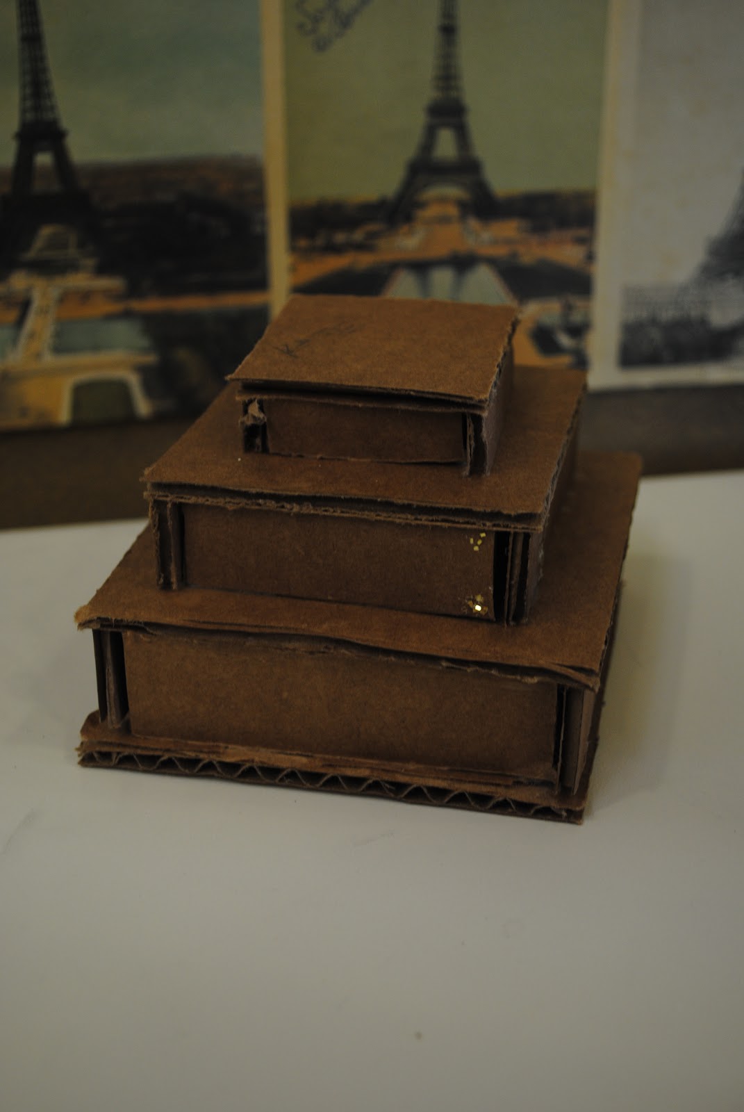
After looking at a light presentation, I got inspired by a tiered chandelier. I then went and sketched out a geometrical, triangular prism basically. I constructed a small model from my sketch. I thoroughly enjoyed the overall shape and look of the model, but knew it wouldn't successfully reproduce the light phenomena.

I further proceeded to create a second model. This one was larger than the first, and I cut half inch slits at the top of some of the walls to allow the light to come through. The basic idea was solid, but when I tried it out with the light, the light simply came through the cut slits. There was no shadow created, and that's what I need.


My third model has been the most successful in many aspects: shape, size, and use. I had to create overhanging tiers so that the light had something to reflect off of when it came through the slits. I painted the underside of each tier white so that the reflection was stronger and would hopefully create a successful shadow. And guess what? It did.


In the fourth model I plan to construct, I have many things I need to change. I will add more tiers (probably six in total), fix the proportions, and possibly make it a few inches taller and/or wider.

For my final luminaire, I plan to create the middle structure fully out of wood, and the tiers will be made out of white or frosted plexy-glass.

Update: December 7, 2010

I ended up constructing another model, fully out of cardboard, that did indeed have six tiers.  The tiers were all 9X9 inch squares that were spaced equally apart on the 15 inch structure.  I painted the top side of each tier white to help enhance the shadow effect I was going for. The half-inch slits under each tier would be the light source.

In critique, I found out this model wasn't going to work. There were no apparent shadows, and in my opinion, it just seemed bulky. I was also holding the light bulb in the structure because I had not come up with a way to secure it in yet; this may not have helped the issue.

I knew there were many things I had to change, so I went back and created my sixth model. (This bulky, unsuccessful model unfortunately fell apart before I could photograph it).

For my sixth model, I used black foam board for the  middle structure, and white foam board for the tiers. My thought process with this was that the light would surely reflect off of the white tiers and the light would be less likely to leak out of the middle if it was all black.

This model was 15 inches tall, and had 6 tiers (like the previous model).  The different design ideas that went into this one included cutting the tiers and placing them on the structure differently. This time, the tiers progressively decreased in size as they got closer to the bottom. I did this because I didn't like the bulkiness of the previous one, and this relieved that issue. I also placed the tiers BELOW the cut slits, rather than ABOVE them. These light slits, like the tiers, changed in size; however, the slits got larger as they went down.


I am happy to say that this model was very successful. The light came out of the slits perfectly and created a shadow on each tier. I also adored the contrast of the white and black because it emphasized the shadow effect that I was going for.

I originally wanted to make this structure out of wood, and the tiers our of plexi-glass. I ran into some problems with this though. I did not buy strong enough wood and couldn't easily find white plexi-glass. Trying to work around this problem, I made another model made out of the black foam board, and attempted to use clear, corrugated plastic for the tiers. Needless to say, this model was not visually appealing, and the light leaked through the corrugations, disabling any shadows from being made.

After all these obstacles, I decided to stick with the sixth model. I created a seventh, and final model that was cleaner and more precise. I also added a white box to the top to hide the light bulb in a neatly done way.

I was thoroughly impressed with my final luminaire. My light effect was successful, and the overall structure was visually appealing. I will admit that there are some aspects that could have been cleaner, but overall, it was a great success.


This is the project board that went along with the final luminaire. I don't feel that the rendition drawing gives this structure justice because I didn't know how to represent the light. I didn't want to redraw what was going on, I wanted to represent what the light was doing; and that was that the light would get brighter as it escaped (especially in the original photograph). 


26 October 2010

YOU DON'T KNOW DAN FLAVIN


One might not think of light as a matter of fact, but I do. And it is, as I said, as plain and open and direct an art as you will ever find.
                                                                           —Dan Flavin, 1987


Who: Dan Flavin

Born: April 1, 1933 in Queens, New York.
Died: November 29, 1996 in Riverhead, New York.

In the beginning:
Early on, he went to parochial school and later mandatorily attended a preparatory school for the seminar.  In 1953, he enlisted in the Air Force where he was trained as meteorological technician. It was here where Flavin began using his free time to create art, visit art museum, and collect art. Flavin studied art history for at Columbia University for a bit, but realized it wasn't his true calling. From there he moved onto studying painting and drawing.

In 1961, two major events marked Flavin's life. He married his first wife, Sonja Severdija, and began using light as an art form.

His first works using this new art form were called the Icon Series, which were eight colored cubed figures. These were constructed using fluorescent tubes with incandescent bulbs attached to their sides. This piece was named Icon V.
                                                                                                
Flavin made sure to ONLY use commercially available flourscent tubing that are in standard colors, sizes, and shapes.

Later on:


The first piece that Flavin created was called "diagonal". It was a yellow flourecsent light tube that was placed against a gallery wall at a forty-five degree angle. The way the yellow light reflected off the wall was what really inspired Flavin to continue with this radical idea of his.


Flavin was greatly inspired by many Impressionist artists.  His flourescent lights grew out of traditions of the post WWII American Art. Abstraction became a dominant mode of artistic expression. More specifically, there is a similarity between Mark Rothko's luminous paintings with glowing, hovering forms, and Flavin's radiating colored lights.

Flavin preferred standard flourescent light bulbs than the loud neons. With that in mind, he decided to use a limited color palette that included red, blue, green, pink, yellow and ultraviolet. He also stuck to certain sizes of tubes that included two, four, six, and eight foot tall tubes.

Flavin's work isn't only about the flourescent tubes, but also about the space they illuminate. The colors that would reflect onto the gallery walls would create a new place for an art composition. Flavin's creations relate both to structure and paintings because they are 3D, but are mounted flat up against a gallery wall.

Most of Flavin's work was left untitled, and was instead "dedicated" to someone. That someone was normally the person that inspired him to create the flourescent art piece.

Some of his art works include the following:


"untitled (to Bernett Newman to commemorate his single problem, red, yellow blue"

"Greens Crossing Greens (to Piet Mondnan who lacked green)"


Flavin's last artwork was at Santa Maria Annunciata in Chiesa Rosa, Milan, Italy. The design for the piece was completed two days before Flavin death. The installation was completed one year later with the assistance of Dia Center for the Arts and Fondazione Prada. 


Information credited to:

"Dan Flavin: A Retrospective." National Gallery of Art. National Gallery of Art, 2010. Web. 25 Oct. 2010. <http://www.nga.gov/exhibitions/2004/flavin/monuments/monuments.shtm>.

"Dan Flavin." Wikipedia. Wikipedia: The Online Encyclopedia, 9 Oct. 2010. Web. 25 Oct. 2010. <http://en.wikipedia.org/wiki/Dan_flavin>.

18 October 2010

...WOODLAND CREATURE...

PHASE TWO

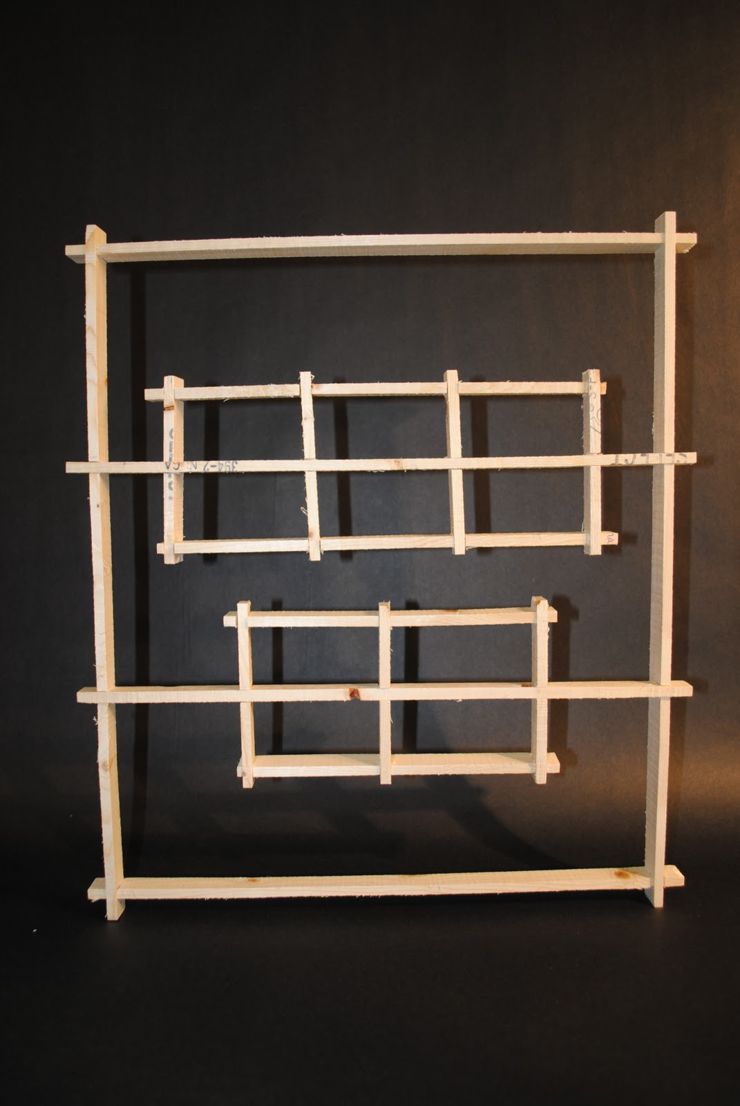
Phase two of our huge final project is simply this:  Make at least FIVE cuts in a 2 X 4 X 18 piece of wood and have the pieces joint together.  We are not allowed to use anything but this piece of lovely wood and the scary tools in the wood shop.  Sound easy?  Wrong.  I have a few ideas that were inspired from the following pictures:


I have cut my wood chunk into 18" strips that are 1/4" thick.  At this point I'm not sure how I'm going to assemble it, or where I will cut notches for joints, but we keep moving forward...

[October 24, 2010]
So, I award this wood project with my first mental breakdown of the iARC undergraduate program.
The project is as complete as it's going to get. That does not mean I do not have a finished project, but there were a few things I would like to change if I had the time. I am proud of the final composition for the most part, but I wish every nook-and-cranny pieced together perfectly.


I used my first piece of wood to set up the basic design and concept that I had planned. I eyeballed each measurement, and wasn't TOO careful with the craftsmanship since I was initially planning to use it as my prototype. As I look at my first and second attempts at this project, I feel like my first attempt was more successful.

Using my "prototype" as a guideline, I began to cut and measure the pieces from my second piece of wood. As I thought I was taking special care to get each measurement right, I managed to screw up severely. I measured basically everything except for the frame and middle pieces wrong. I failed to realize this until I got back up to my studio space to assemble this project. Feeling at a loss at that point, I just put my head down and started crying. After letting it all out, I sucked it up, re-measured everything, and was able to get a piece of wood from another classmate.

My third attempt at this was much more successful; I just had to rush to get it done. And of course, everything couldn't go the way I wanted them to. The bandsaw that I had to use moves from side-to-side too much, and kept breaking off pieces of my wood. I lost at least half of my wood pieces because of that. Trying to continue with my work, I went back up to my studio to assemble as many pieces as I could. I measure one thing wrong (again!), and had to re-cut half the pieces that broke. At this point however, I had run out of time.

My final project is a little shaky. My craftsman ship could be a little bit better, and I wish I had time to go back and re-measure the one piece that is wrong. During final construction, more pieces began to break. I also wish I had time to make extra support stands for the structure so that it was much more stable. I was getting more and more frustrated, and losing any hope with this project. 


With minor improvements, this project will be what I want it to be. I do plan on going back to fix the notches so that this project will end they way I wanted it to.

05 October 2010

OH SUNLIGHT, WHERE ART THOU?

Phase One:

The presentation board that showed the sun phenomena that I captured using a photograph, an illustration, and a diagrammatical model.

__________________________________________________________________

This is phase one of our final project... a project that will last the entire semester. We had to capture sunlight in any way we could. I got a taste of everything in my photographs.

I love photographing effects of the sun. I wish I would have captured a silhouette of some sort because I feel the illumination of the sun in those pictures is exquisite.


27 September 2010

STWIGALICIOUS

When this project was first introduced to us, I had the same apathetic opinion about it as I did with the leaf project. On the up-side, I was happy that we weren't as tied down by rules that we had been before.

At first, I wanted to integrate my photography into this project, somehow, some way. I also wanted to incorporate a vase-like structure in which both my photos and the stwigs would be displayed. When I proposed this project to an instructor, it was bluntly turned down. So I headed back to the drawing board.

I still wanted to integrate my photography into my project somehow, so I can up with the idea of creating a "picture frame" for my stwigs. When I built the first prototype, I didn't feel that my idea was being represented well; it seemed too simple. I was stuck at this point...

I was later inspired by something I saw by one of the fourth year students. They were integrated bookshelves into their created reading space that were basically rectangles that got more narrow at the bottom.  This inspired me to come up with a design that was basically two triangles that shared a common middle base.

My first prototype that used this new design took everything away from the twigs. It was green, had a backdrop, and was just too big. I knew before I went into critique that I was going to take away the backdrop, but keep the same basic form.

I tried out many materials to create this form (foam board, bristol paper, poster board) and none of these wanted to hold the shape (this was without the stwigs). I finally tried out using matte board, and it worked out well. It held the straight angles and lines that were my ideal structure.

When I began constructing this structure and integrating the sticks, I encountered a few problems. My sticks were continuously breaking because the matte board was so thick and trying to urge the sticks through the pre-cut holes was not working out well. I also realized that this structure was going to be hell to try and reproduce again; it also took away from the angular structure of all the twigs.

At this point, I felt like I was at a loss. I had a crap load of matte board left over, and my stwigs were just laying on my bed. I began to contemplate how I could show off the stwigs for all their angular beauty... and that's how I came up with the final design.

I built a very simple 14X3 base out of the matte board and measured out where I wanted each twig to be placed. Once I had all the sticks in place, I didn't like how the bottom of the sticks could be seen underneath this base. This is when I cut out two pieces to be the "front" and "back" of the base structure. When I had it laying flat on the desk, the twigs wouldn't stand the way I wanted them to. So I focused on the sticks and let the base work around them. When I got the sticks back into the position I wanted them to, I had failed to realize I created a structure that was basically floating. I thought this added to the overall composition, so I left it that way.

I knew it was simple, and it almost seemed too simple. The "back" side has also shifted overnight and dried at an angle which led the "back" side to only float half of the way. I was disappointed that this had happened.


I wish I could have stuck with my "Z" shape, but I felt good about my simplistic creation in the end. I felt that it showed off my sticks the way the needed to be presented.